 Pages Before Pixels
Plan a menu so visitors find things quickly
Last reviewed
The short version
- Your main menu comes straight from the top row of your sitemap.
- Keep it short. Use words your visitors would use.
- Group by what people want to do.
What navigation is
Navigation is how people move around your site. The main part is the navigation bar, a row or column of links.
A site typically has a primary bar, and sometimes a second one.[1] The links point to the most important sections of the site.[1]
In general, bars sit in the header, though they can also run down the side.[1] This page is about what goes in the menu, not how it looks on a small screen.
From sitemap to menu
Look at the top row of your sitemap. Those pages become your main menu.
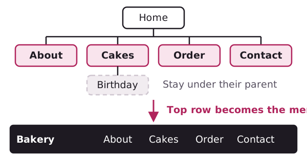
Pages further down don't need a spot of their own. Put them under their parent. A visitor to Cakes will find Birthday and Wedding there.
Keep the list short. If you've got twelve items, some of them probably belong together. Go back and group them.
Group by task
How should you group things? One answer comes from GOV.UK. Its main guidance is organised and written by task, rather than by audience or by department.[2]
Compare two menus for the made-up bakery from the last page.
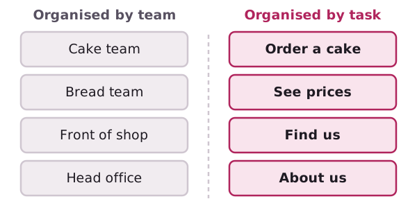
The left menu follows how the bakery thinks about itself. The right menu follows what a visitor wants to do. For most small sites, the right one is easier.
Choose plain labels
A label is the word on a menu button. Pick a word your visitors already use.
Digital.gov warns about vague headings such as "General" or "Application". It says they can be so vague that they aren't helpful.[3] The same goes for menu labels.
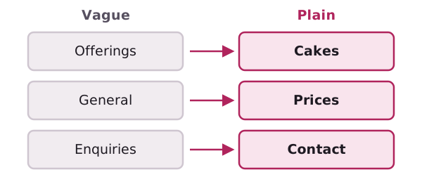
Short labels are good, but not at any cost. "Prices" tells people more than "Info".
Where menus go
Put the main menu in the header, where people look for it.[1] Keep it in the same place on every page. If it jumps around, people lose their way.
A footer is a good home for the small stuff, such as a privacy page. Those pages matter, but few visitors need them.
Breadcrumbs
A breadcrumb trail is a row of links that shows where you are. It lets visitors keep track of their location.[4]
Here's a made-up one: Home > Cakes > Wedding cakes. It usually sits just under the header or menu.[4]
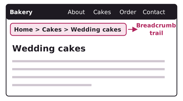
A small site with only a few pages may not need breadcrumbs at all. Add them if your sitemap goes three or more levels deep.
Test the menu on paper
Copy your menu onto a sheet. Show it to someone who doesn't know your business. Ask: "Where would you click to find our opening hours?"
If they hesitate, rename the item. Try it again with a second person.
Next: what goes on the home, about and contact pages.
Sources
- Plan new GOV.UK content, GOV.UK content and publishing guidance (accessed 2026-11-01)
- Headings, Digital.gov (US General Services Administration) (accessed 2026-11-01)